Wednesday, August 30, 2006

Turtle time-
I just finished this quilt for an exhibit in September. The theme of the show was "gilded" and I LOVE to embellish, and I've had moments when, looking back, I think I've gone too far. So, this one was an exercise in controling that tendacy. Most of the gilding comes from Shiva oil sticks in gold, silver and copper. I added a touch of gold thread in the quilting of the shell. The only other touch of gilding is the eyes, which are antler bone buttons with foil added to them. Very shiny!
Turtles are on our minds around here recently. We have two red-eared sliders that are getting a bit too big to stay together any longer in the same tank. Luckily, my DD#2 class has decided they need a classroom pet and voted to take one of the turtles for the year. I'm personally hoping that one of the kids in the class fall in love with him and want to take him home with them! We also get the side benifit of seeing how a seperation effects the two turtles. We'll measure each of them now and then measure them again later. We anticipate the one going to class to end up smaller than the one here because of the tank sizes. I'm also curious about how they will deal with being apart for the first time since, well, maybe ever, since we bought them together when they were an inch big.

Monday, August 28, 2006

Thanks for the comments

I want to thank everyone who commented on my last post and offered their suggestions, both here and in private emails. Most everyone had the same issues, so know where I need to improve.

I want to take a moment here to talk about a critique'. People often talk about how horrible it would be to get critiqued in a bad way. I think it makes people nervous to even talk about other's works. Will they totally trash my work? Will they say "don't quit your day job?" Will they attack my personality, my vision, my mental abilities? ( are you crazy?) In the end, will I just wish I could throw it away and slink into the corner?
No, a good critique' is exactly what I received here from everyone. While people pointed out the trouble spots, everyone did have something good to say about something in it. In my experience, I received a great critique from my peers.
Every quilter works differently. I tend to have a general idea when I begin, where I want to go, but along the way, I do make decisions. Some of them I'm nervous about when I choose them.
Sometimes, I guess I can make the wrong choice. For example, I was afraid the bright leaves, which have Angelina fibers on them, were going to be too bright so I added the border with that light green strip in it to make it seem like they weren't the only bright thing in the quilt.
In reality, caves here are like black holes. The layered rocks make like shelves and light doesn't travel inside all the time. But, I didn't make the left edge varied enough, it's just too straight, and you don't get that feeling of layers on that side.
The irregular edges of the picture part of the quilt... That was one I worried about. In hindsight, I probably wouldn't have chosen to do that. Especially with the straight green strips in the border.
I really didn't think about putting any "signs of life" in the quilt. I wanted it to be like a secret place I found on a hike. In reality, there are thousands more caves here than those that are inhabited by anything other than bugs and bats, although recently there was one found near Springfield, Mo. That had been inhabited long ago. Most of them are rather shallow for living purposes.
All of these are my reasons for doing what I did. Maybe I was wrong, but I did have a reason. LOL!
Oh, sizes. I tend to like working in the 36" range. Some larger, some smaller, but around that size feels good to me.
I know there's been a lot of talk about journal quilts, postcards and ATC's. All of those feel too small. I get terribly frustrated when I work in those sizes. I feel like it's not complex enough, or I feel I put too much in it and it's too busy. I can't seem to get comfortable in those sizes.
Large sizes are also a problem for me. I can't see it all at once and I can't get a good feeling for what I'm doing if I can't see it all at once. Now, why can't I see it? That has more to do with my work space than anything else. Some of you artists out there might have a fabulous studio dedicated to your art. Uh, mine is in my bedroom and I share it with my DH (of course) as well as our bed, dresser, etc... I think I have made great use of my small space, but it's a small space. Sigh! I like to think I do great things in my small space with the time I have.

Sunday, August 20, 2006


Ozark Shelter-

This was a quilt I entered into the IQA show, and it wasn't accepted. Rejected.
This was my first year trying to get into the juried part of that show. I've had quilts AT the IQA show, but they were representing other shows. I knew going in the competition was tough.
I believe they say 45% of the quilts entered get into the show this year. I'm not discouraged. I think I'm capable of work on this level. Either this piece wasn't quite good enough, the jurors didn't like it, or I just didn't capture the true essence of this quilt in my submission images. I'm really not sure which it could be.
Obviously, I liked the piece. I think it has a lot of complex texture, but maybe a bit too simplistic when viewed as a whole.
I've been doing a few quilts now based on the rock formations in this area. This is another such quilt. My last quilt took a more fantasy track, but this is closer to reality. In fact, as far as all the others go, this is the most realistic of the bunch. Perhaps I have gone too far into realistic depiction?
It's all second guessing myself at this point. I think I'm good enough to get in this show, but I'm not sure. I won't give up. I'll try again next year. Maybe some thoughts about the quilt from others will help.

Tuesday, August 08, 2006

design principles-
I'm borrowing this simple explaination of what they do from my good friend and art instructor, Bob Kennedy. I believe he created this as a simple handout for his students to give them a quick frame of reference .
THE ELEMENTS OF DESIGN
The Elements of Design are the things that artists and designers work with to create a design, or composition. The Elements are: line, shape, space, value, color, and texture.
Line … The Graphic Unifier. Curved, Straight, Directional Thrust: Horizontal, Vertical, and DiagonalA curved line is dynamic, ever changing, and more natural, than the straight line, which is more static in character. Direction, while often listed as a separate element, is technically a part of the element "line". The diagonal line is more dynamic and is quicker to draw the eye. It can be used to create movement and depth. Horizontal lines are more static and tranquil therefore calmer, more passive. Vertical lines evoke strength, power, but less dynamic than diagonals.
Shape … Natural, Geometric. Positive and Negative. (The Golden Mean)Geometric shapes are more passive, decorative, and static than organic shapes. Repeated shapes can be used to create movement. Repeating geometric shapes increases the decorative effect. Look beyond the obvious shapes of heads, bodies, buildings, etc., and view your subject as abstract shapes. Change many of the obvious shapes and create new more interesting shapes. Try to find interlocking shapes. Keep the background shapes in the background, but look for places to connect the foreground and background.
Space / Size … Large, Medium, Small. Proportion or Scale. (The Golden Mean)The comparative relation between things. Employ large, medium, small concept. Size can be used to make things appear nearer and of greater importance. Size relationships can be used to create depth (Perspective).
Value … Light, Dark. (Value Patterns)Value can be used to create mood, i.e. dark and mysterious, light and airy, gray and dull. High contrast in value moves things forward; low contrast makes them recede. (Arial Perspective)
Color … Hue, Chorma, and Value. Hue is the specific name of a color, red, yellow, blue (primary colors). (The Color Wheel)Chroma, also called saturation, often called intensity, refers to a colors strength or weakness, bright or grayed.Color Value refers to the lightness or darkness of the color, not to its intensity or to a specific hue.
Texture … Rough, Smooth, Soft, Hard.Texture shows at the edges and in the play of light and shadow on the surface.A COMPOSITION is an arrangement of all the elements, which achieves a unified whole. But alas, it is merely a tool to create form and content. Content relates to human emotion and the intellect and is the end result of the reasons for painting. Design is a means to that end.See: Types of Compositions and A Simple Approach to Good Design
ATTRIBUTES are defined as the qualities that the art or design conveys to the observer.Emotional … Active, PassiveEsthetic … Realistic, Impressionistic, Abstract, DecorativeSpatial … Depth, Flat

THE PRINCIPLES OF DESIGN
The Principles of Design are achieved through the use of the Elements of Design. Each principle applies to each element and to the composition as a whole. The principles are unity, harmony, balance, rhythm, contrast, dominance, and gradation.
Unity … Echoes of all elements relating. All things are connected and belong to the whole. The distinguishable units and elements seem to belong to each other so that each contributes to the functioning of the whole. The work is complete when no element can be changed without detracting from the whole.
Harmony … Within each element and as a whole.Harmony can affect the emotional response to the composition.
Balance … With the "weights" of the segments of each element.An equilibrium of similar, opposing, or contrasting elements that together create a unified whole. Forms of balance: Asymmetrical Balance and Symmetrical Balance.
Rhythm … Variety and Repetition.Variety within the design of all the elements and principles, along with, the regular repetition of particular elements or stresses, also, the suggestion of motion by recurrent form.
Contrast … Alternation.Provide contrast within each element i.e. light, dark; soft, hard; warm, cool, etc.
Dominance … Within each element. (Center of Interest and Focal Point)Dominance provides emphasis. The center of interest is the area within the work to which the eye is drawn. The Focal Point is the point within the center of interest that catches the eye. It is this area and point that the artist emphasizes through the use of the elements.
Gradation … Modeling, (the 3-D effect), Transitions.Used in modeling or producing a three dimensional effect and in transitional effects. Gradation of detail from foreground to background. (Ariel Perspective)
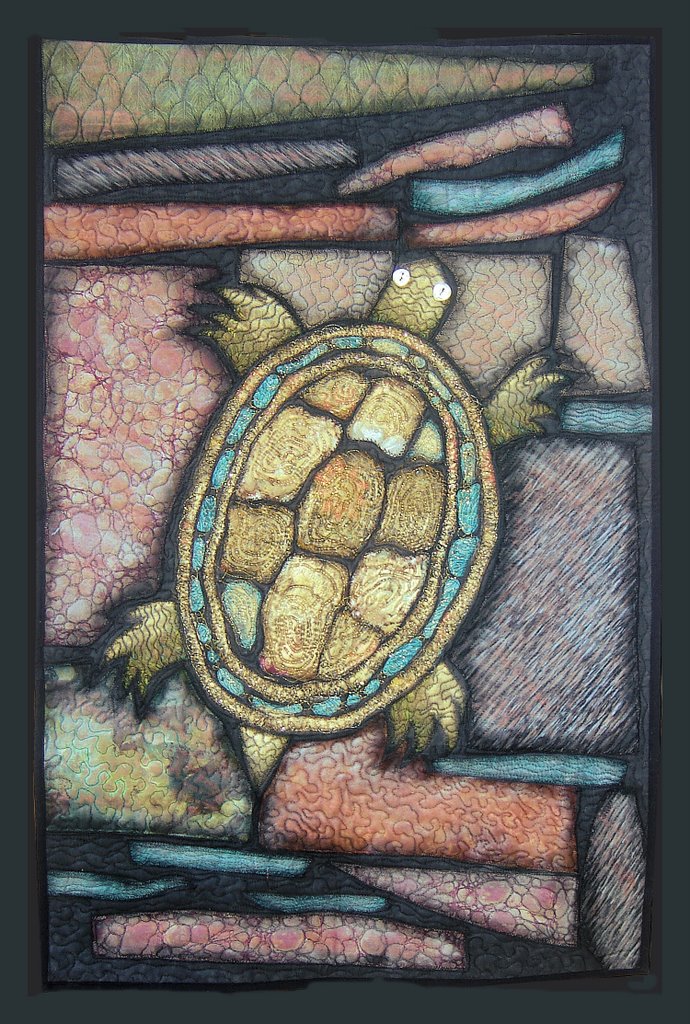
Thursday, August 03, 2006


The Fair

My girls are involved in 4-H and some of their projects advanced from our county to the regional competition which is held at the fair.Each county takes turns to watch the 4-H exhibits and answer any questions. Some girls were also invited to do their "share the fun" skit on one of the stages. So, off I went with the girls to the fair.
Let me just say I'm not really one who enjoys amusement parks much and fairs are even worse. Not to even mention how HOT it's been here. I typically am convinced to attend these sorts of things by my DH, and guilt for wanting my kids to have pleasant childhood memories, but my DH is out of town working and I knew it would be all up to me to at least try not to be such a downer.
So, now that you know how I feel about these sorts of places, I did try to make the best of things. Luckily, the girls enjoyed riding the rides with the other girls, so I didn't have to ride anything. I did have some good conversations with the other leaders/ moms and some of the others more knowledgeable about 4-H stuff in this state.
I was a bit disappointed with the fair exhibits, especially the arts. Looking over the rules for the quilting section, I never did see any place my sorts of quilts would fit in. Most of the quilts I saw on exhibit were beautifully made, but very traditional. I don't think top people in their field would bother to enter with prize money being so low. In my case, I thought it wasn't worth the drive up there. Maybe I was wrong.
I think I was surprised there weren't more political booths there with elections coming soon and there were WAY too many booths dealing with windows, vinyl siding and roofs. I thought the booth talking about ethanol and flex fuel vehicles was interesting. I was able to pick up some free gun locks from the dept. Of conservation booth. (why I'd need them is too long to go into now) We were looking forward to seeing a cow born at the birthing center, but while some of the cows looked close at times, none were born all day. We did try to milk a cow. I've always wanted to try, but never had the opportunity. We had other types of animals growing up, but my dad drew the line at a milk cow, since it severely limits your ability to go anywhere. I was able to get milk my first try and so was DD#2. DD#1 didn't want to try.
We were happy to drag ourselves to the car and drive home in the AC. (so happy I have a car with AC!!!)